Yoginess Brand

Client
Yoginess s.r.o
Industry
Fashion
Year
2022-Now
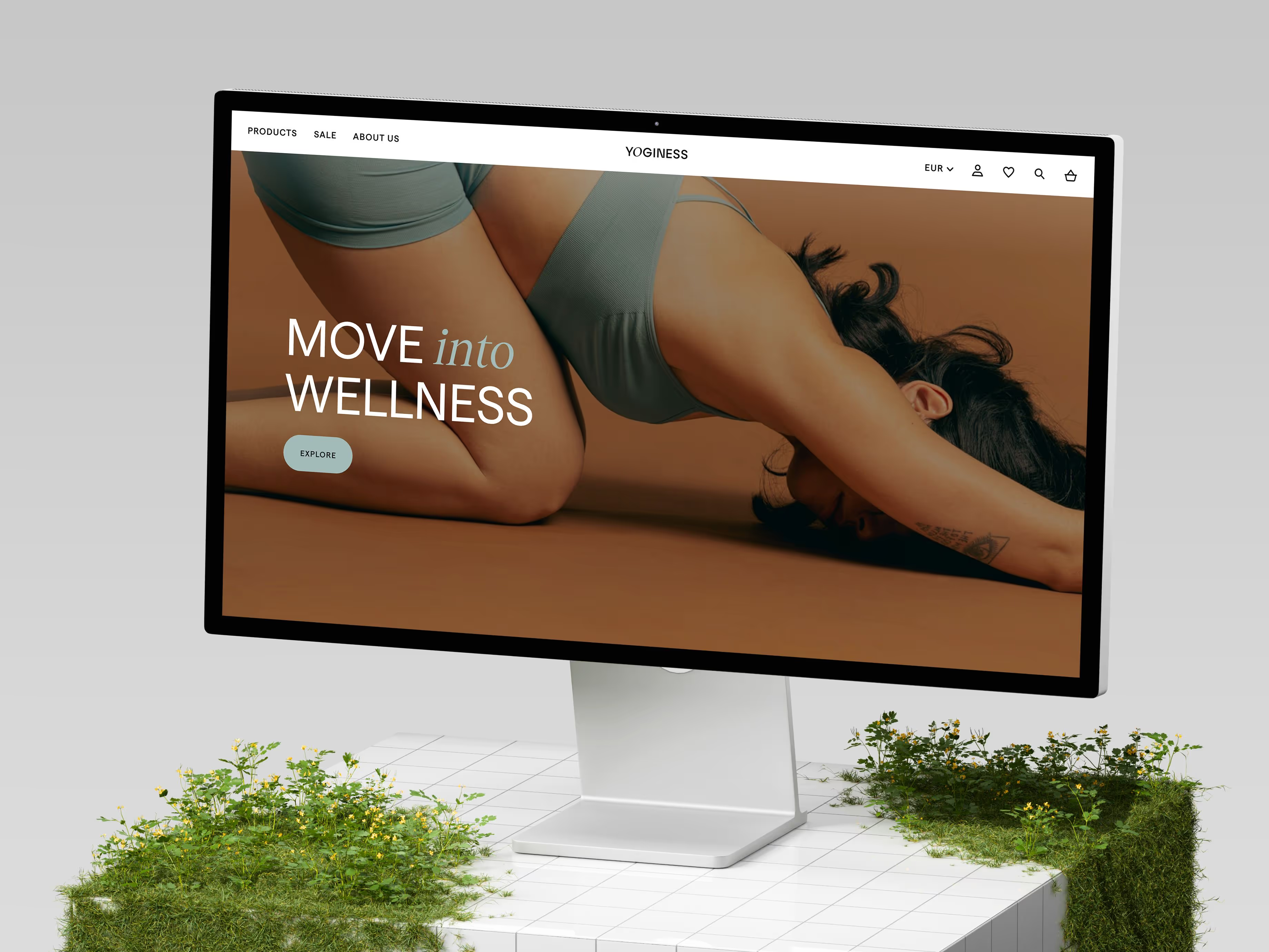
Yoginess is activewear for an active lifestyle—not only for yoga. As the brand has grown from Slovakia to reach all of Central Europe with locally-sourced materials and European manufacturing quality, Yoginess needed a refreshed brand identity that better reflected its premium offerings and digitally-native e-commerce model.
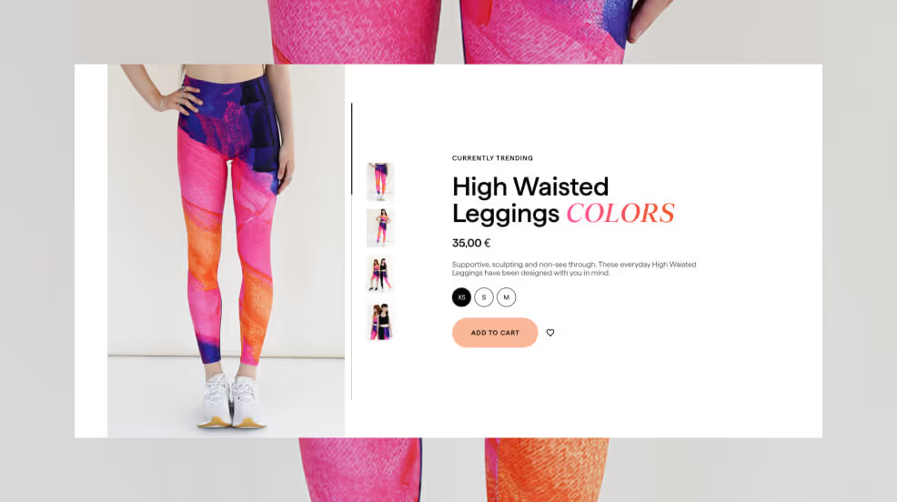
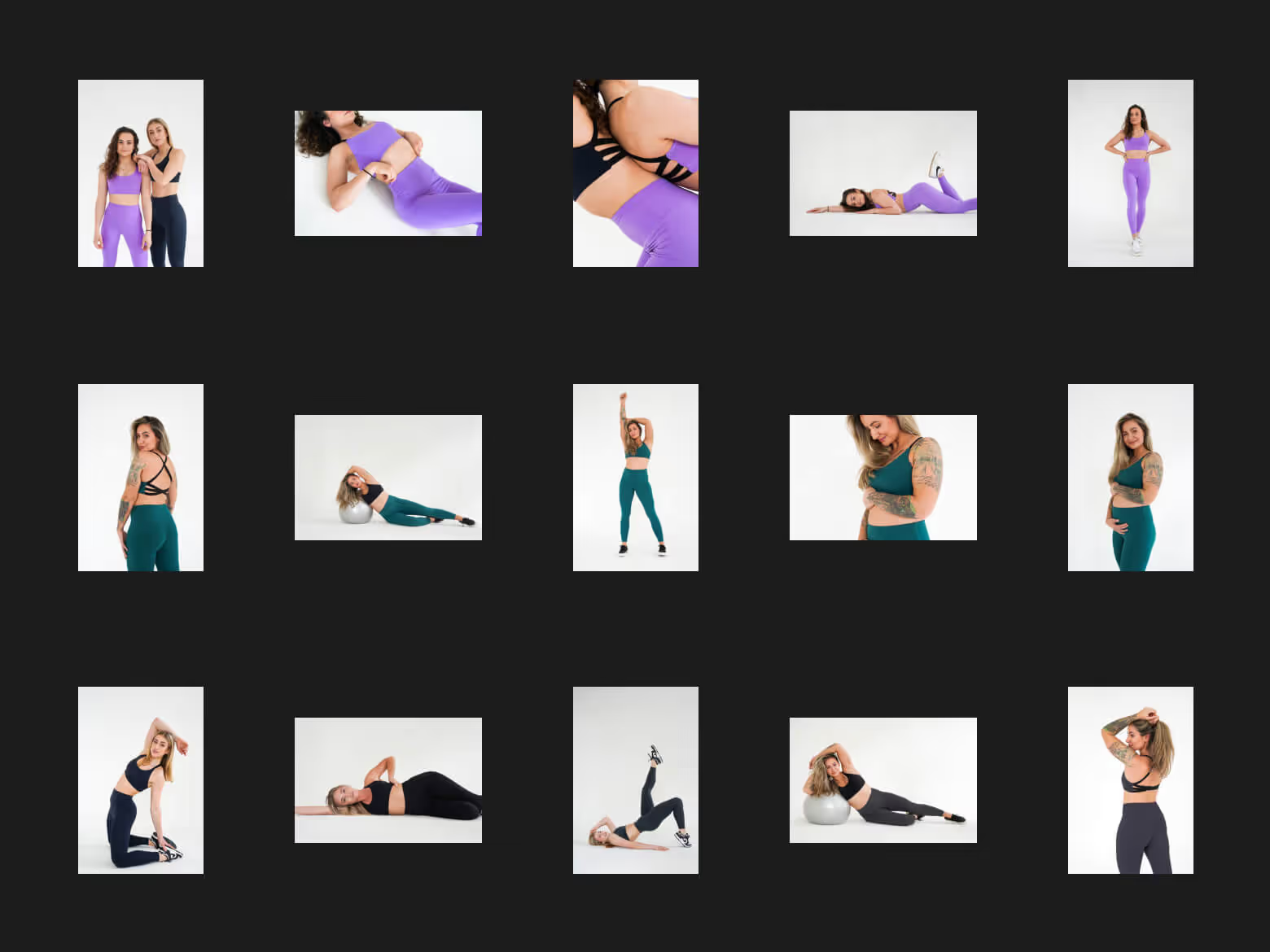
By staying restrained to large photography, clean backgrounds, and simple layouts, Yoginess customers can enter the headspace of zen and balance from their first interaction with the brand. From top-of-funnel marketing efforts to a high-converting website and every touchpoint that follows, the Yoginess brand is designed to stretch the business’s potential even further.

Yoginess logo
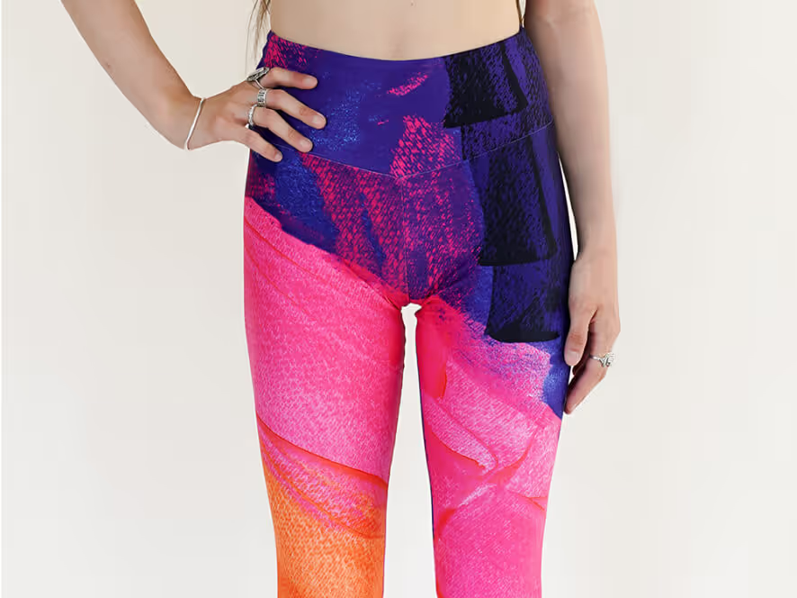
Campaign visual






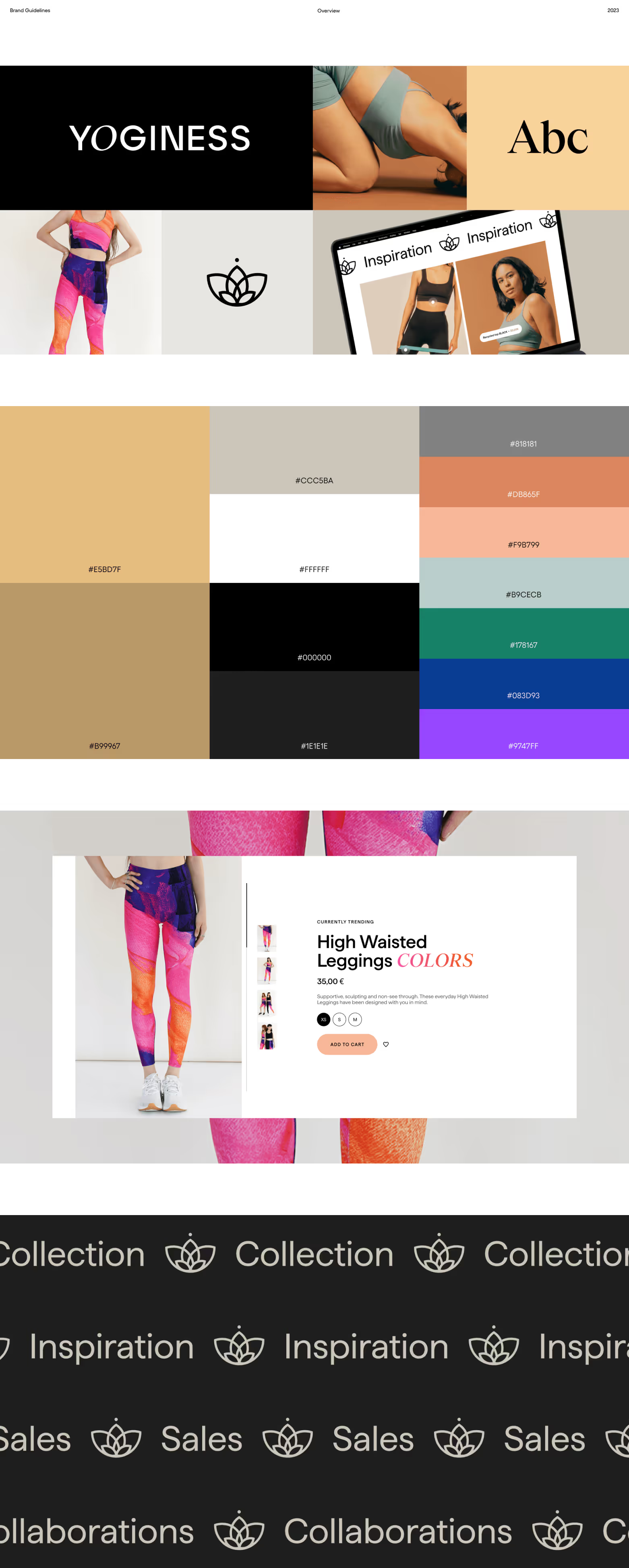
Brand guidelines
Brand design built on a Basis of simplicity.

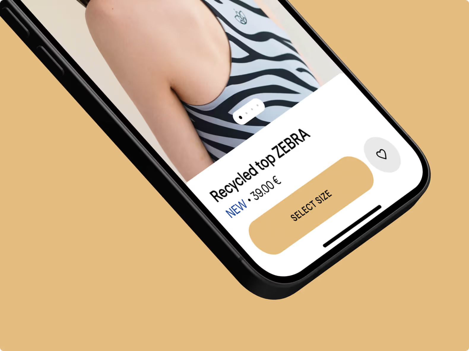
Mobile e-commerce
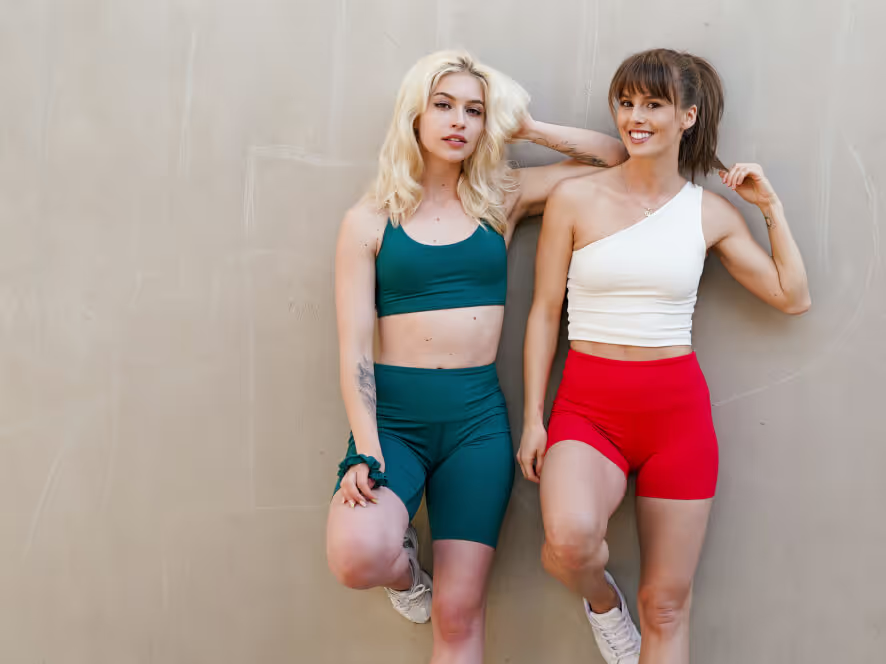
Campaign video
Contact Us
Reach out at hello@basis.work with any project. Let's get started.
Team
Client
Yoginess s.r.o
Industry
Fashion
Year
2022-Now
